Tuesday, May 10, 2016

meArm User Interface: (4) Complete UI and ROBOlympic Results


The final blog posts for these classes are always somewhat bittersweet. Today I'm presenting to you what we've been working on for weeks; the final MeArm UI. I highly recommend watching the video to see our robot in action, but since the UI itself may be hard to see in the video, here's an additional screenshot:

Want to see our UI in action firsthand? Download it here! But you'll need our MeArm for it to work...

The interface itself may seem simple, but it took a lot of work to code and get looking just right. The biggest challenge in coding two interfaces side-by-side was locking all the buttons for one mode when the opposite mode was selected. In this way, we could participate in the events of the ROBOlympics without relying on the program we were given to start off with, while simultaneously having a UI catered to the purpose of our custom function. Personally, I wish I could have done more to make the UI more visually appealing, but time got the better of me; still, all the buttons worked as they were intended to in the end, and I think that in itself is quite the victory.

With the end of the semester and the end of our final project came the ROBOlympics, as I have mentions - a competition to see whose robot and UI in the class was the best of the best. There were four events, none of which we placed in the top three of... except for the Talent competition. As luck would have it, all the hard work we spent creating the crane game paid off, as we were able to manage third place by popular vote! Again, a small victory for Enzio and me.

In the end, though, our robot's talent wasn't enough to place in the top three of the entire competition overall. Or the top four. Or five. Or six. Yes, of seven different robot UI pairings, our humble little robot placed seventh - dead last. But really, what can I say? We worked our butts off on this thing, and I'm still incredibly proud of what we were able to create.

Where will I go from here? In a year, I'll be graduating from Cardinal Stritch with a Bachelor's degree in Computer Science, and even sooner next Fall, I hope to land a solid internship in the Computer Science field. Honestly, I don't know what the future holds for me - have I learned enough to make my debut in the working world, doing what I love to do (programming)? Or will I be thrust into an environment where, to my horror, I find that I simply don't have what it takes? I can't say for sure; all I can do is keep my head held high and hope for the best.

Paige Ruka

Sunday, May 8, 2016

meArm User Interface: (3) Testing the Crane Game


Testing the crane game.  For our specific function/task, we wanted our robot to replicate the movements of an arcade crane/claw game.  If you watch the video, you can check out some of our crane game shenanigans; we weren't ever actually able to grab the candy off my hand, but hey, these crane games are supposed to be difficult!  It adds to its charm.
Above is what our code looks like every time the "Pickup" function of the crane game is run.  It functions as a series of five steps: (1) the opening of the claw, (2) the lowering of the claw, (3) the closing of the claw, (4) the raising of the claw, hopefully with item in tow, and (5) returning the claw to its starting position.  Getting the code to run smoothly was tricky at first, but the code we wound up with seems to work quite well.

The next blog post will demonstrate the cleaned-up UI, with not only just the crane mode but the completed free mode as well.  After that, we're ready to take on the ROBOlympics with our MeArm and custom UI!

Paige Ruka

Sunday, May 1, 2016

meArm User Interface: (2) Coding with ControlP5


UI progress.  The past week was slow as Enzio and I experimented with the ControlP5 library and tried to wrap our heads around everything we needed to accomplish.


Though our current work is not so aesthetically appealing, the functionality is there. The video above is to demonstrate that we have a system in place where certain buttons will "lock" after being used, forcing the user to follow the rules of our crane game system as detailed in the previous post.

As we move forward into the final week before finals, Enzio and I plan to split the remaining workload as follows:
Enzio's main goal is to get the buttons to move the robot arm as intended. As it stands, we have been using placeholder variables where the servo positions need to be updated, so he will troubleshoot that aspect of things as well as getting a start on our robot's specific task (picking up an item as an arcade crane game would do, dropping it in a designated location).
My main goal is to complete the "Free Mode" side of the UI and make everything look more appealing overall. What you may or may not have noticed is that we took a departure from our two-tab initial design and elected to have both modes visible at once, on two opposite sides of the sketch. However, as one may expect, only one mode can be activated at any given moment.
Despite what we have so far not looking like much, I think we're on the right path to finish this semester off with a spectacular project.

Paige Ruka

Wednesday, April 20, 2016

meArm User Interface: (1) Project Planning

For our final project in Visual Programming, Enzio Garrett and I will be collaborating to program a creative GUI, which will allow users to control our robot meArm.


As depicted in the rough sketch above, we want our user interface to essentially have two modes: a standard "free movement" mode, which will include standard buttons and sliders (and possibly mouse interaction as well); and a more restricted "crane game simulator" mode, which would mimic the actions/movements of an arcade crane game. The crane game would be much more restrictive in how the user can move the arm, as with any game, there are specific rules attached. We would make these rules clear within the program itself, allowing users to view the instructions whenever they wish.

We still have to program the UI itself and the custom movements included within the crane game, so expect more updates throughout the following weeks.

Paige Ruka

Saturday, April 9, 2016

meArm: Construction, Calibration, and Circuits

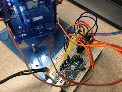
Just a brief post today. Over the past few weeks we've been hard at work building... robotic arms! That's right! I never imagined myself making something like this, but the final result is pretty sweet.


The next thing we'll do, if my understanding is correct, is create our own GUI dedicated to controlling this robotic arm.

Paige Ruka

Sunday, March 20, 2016

Graphical User Interface: (3) Final Results


Finally, the buttons and sliders have been added, and I have a complete (yet simple) GUI. It wound up looking almost exactly how I had hoped it would, so that was a plus. It also got me some much-needed practice using the ControlP5 library, though a lot of what I did in that regard was copying and pasting from examples. However, incorporating the examples into my own program helped me to understand what was going on and getting a better feel for what can be done with the library as I get more comfortable using it.

Here's a link to download my Processing code with all images included.

Paige Ruka

Saturday, March 19, 2016

Graphical User Interface: (2) Assets


I was able to find some free game backgrounds that will tile and loop while Kirby is walking, and I wanted to share my finds.

http://opengameart.org/content/bevouliin-free-game-background-for-game-developers
http://opengameart.org/content/bevouliin-free-mountain-game-background
http://opengameart.org/content/bevouliin-pyramid-free-game-background-for-game-developers
As I mentioned, I want to have the background scroll as Kirby is walking either left or right to create the illusion that he is going somewhere, rather than walking in place.

Unfortunately, in my search for images, I haven't yet been able to start the real bulk of this project, the user interface. However, I have a strong idea in my head of what I want to include... it's just a matter of getting things to work with the ControlP5 library.  Of course, if I run into any troubles, I will post questions here as they come up.

Paige Ruka

Tuesday, March 15, 2016

Graphical User Interface: (1) Project Proposal

I've been struggling to come up with an idea for this one, but I think I've finally come up with something that's (a) manageable within the time frame and (b) an idea I can have fun with.


My plan is to take this adorable pixelated Kirby sprite and have his movement controlled by the user of the program. I hope to have some sort of scrolling background, which can be changed based on three preset options, and I also would like to utilize the tint() function to involve color. Here's my rather poorly drawn mock-up of how I'd like the interface to look.


I know my drawing is nothing to sneeze at, but hopefully you still get the basics of what I'm aiming for. With 3 color sliders, 2 directional buttons, and 3 background buttons, I hope to be well within the requirements for the project.

Expect more updates on this fairly soon! I'm excited to finally get started.

Paige Ruka

P.S.: Here's some code I was tinkering with as I came up with the idea. I split up the GIF into different frames, since I want to be able to control when the images are cycling and when Kirby should be standing still. That system's not in place yet, but I think it should be easier to do with the individual frames.
PImage[] kirby;
int counter;
void setup() {
  size(210, 190);
  background(255);
  frameRate(10);

  kirby = new PImage[10];

  kirby[0] = loadImage("K0.png");
  kirby[1] = loadImage("K1.png");
  kirby[2] = loadImage("K2.png");
  kirby[3] = loadImage("K3.png");
  kirby[4] = loadImage("K4.png");
  kirby[5] = loadImage("K5.png");
  kirby[6] = loadImage("K6.png");
  kirby[7] = loadImage("K7.png");
  kirby[8] = loadImage("K8.png");
  kirby[9] = loadImage("K9.png");

  counter = -1;
}
void draw() {
  counter++;
  if (counter >= 10) {
    counter = 0;
  }

  background(255);
  image(kirby[counter], 0, 0);

  println(counter);
}

Tuesday, February 23, 2016

Digital Clock Redesign: (6) Final Design & Download Link


With just a few short hours to spare, I have completed my digital clock redesign! I'm very happy with the result. The divider between the hours and minutes changes from white to black based on whether the number of seconds detected by Processing's built-in second() function is odd or even. I've successfully created a method of fading from one number to the next, and the color of the cats changes every minute.

I've also included a download link: https://www.dropbox.com/s/q1c4k3sgj2t6nla/Digital_Clock.zip?dl=0. Since I've included images in my sketch, simply copying and pasting my code won't suffice; you'll need the vector files as well for it to work. This is something I hope my peers will consider including in their posts as well if they have also used external media in their piece.

Paige Ruka

Sunday, February 21, 2016

Digital Clock Redesign: (5) Almost There


I feel like I've spent far more time on this than I should have to gain such a simple result visually. But, as you can see if you take a look at the code, a LOT is going into this. I just figured out the system for fading from one number to the next. That's cool. I also updated my vector for the number "1" since I'm incredibly picky and didn't like that it wasn't the same width as the others.

Not quite there yet... I'm still wanting to do something more with the color of the cats. I'm getting close to the end, though.

Paige Ruka